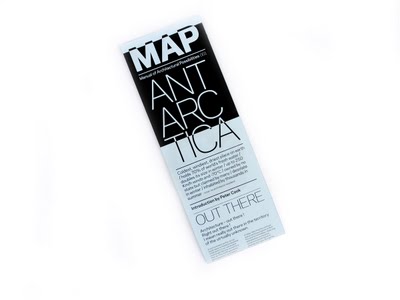
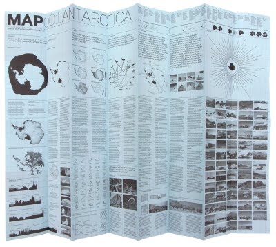
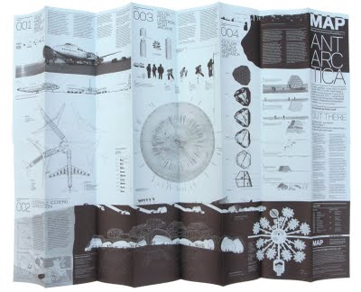
map 001: antarctica


images via davidgarciastudiomap.blogspot.com
“MAP (Manual of Architectural Possibilities) is a publication of research and visions; research into territories, which can be concrete or abstract, but always put into question. Map is not a magazine (it only has two pages) and is not a book (it is issued twice a year). Map presents itself as a folded poster (A1) where information is immediate, dense and objective in one side, and architectural and subjective on the other. Map is a guide to potential actions in the built environment, a folded encyclopedia of the possible, a topography of ideas, or a poster on the wall.”
tufteisms
I stumbled across this list of “Tufteisms” via City of Sound (an excellent blog, by the way). I especially like number 3.
20 Tufteisms from The Visual Display of Quantitative Information
- Graphical excellence is the well-designed presentation of interesting data – a matter of substance, of statistics, and of design.
- Graphical excellence consists of complex ideas communicated with clarity, precision, and efficiency.
- Graphical excellence is that which gives to the viewer the greatest number of ideas in the shortest time with the least ink in the smallest space.
- Graphical excellence is nearly always multivariate.
- Graphical excellence requires telling the truth about the data.
- The representation of numbers, as physically measured on the surface of the graphic itself, should be directly proportional to the numerical quantities represented.
- Clear, detailed, and thorough labeling should be used to defeat graphical distortion and ambiguity.
- Write out explanations of the data on the graphic itself. Label important events in the data.
- Show data variation, not design variation.
- In time-series displays of money, deflated and standardized units of monetary measurement are nearly always better than nominal units.
- The number of information-carrying (variable) dimensions depicted should not exceed the number of dimensions in the data.
- Graphics must not quote data out of context.
- Above all else, show the data.
- Maximize the data-ink ratio.
- Erase non-data-ink.
- Erase redundant data-ink.
- Revise and edit.
- Forgo chartjunk
- If the nature of the data suggests the shape of the graphic, follow that suggestion. Otherwise, move toward horizontal graphics about 50 percent wider than tall.
- The revelation of the complex.
Read more here.
